Scared of Dark Paint? What an Anish Kapoor Exhibition Taught Me About Colour

A few weeks ago I went to the Anish Kapoor exhibition at the Hayward Gallery in London. I knew of Kapoor's sculpture work and had seen the brilliant Cloud Gate bean-shaped mirror sculpture in Chicago several years back, but I wasn't prepared for some of the works in this new exhibition.
In particular the 'Vantablack' images.

Vantablack is a substance created 'with nanotechnology that absorbs up to 99% of visible light. It subverts our capacity to detect depth, contour or texture.' [Southbank Centre]
If you've not come across this substance or colour before then those words might not register a huge amount.
But if you have been to the exhibition then, like me, the shapes created with this blackness (pictured) might also give you a visceral reaction. For me I feel a slight tightness in the chest and an uneasy feeling even just looking at the photographs.
The circle on the floor, for example, tricks your eyes as you approach it and you can't quite tell if it's a hole in the ground so deep you couldn't imagine what might lie down there, or just a black circle painted on the floor. It's neither and it's both.
Will dark paint colours make my room feel smaller?
Seeing this blackest of black substance with my own eyes made me think of all the times I've heard clients say "I'm worried that paint will feel too dark" when I suggest a bolder shade than they'd been imagining.
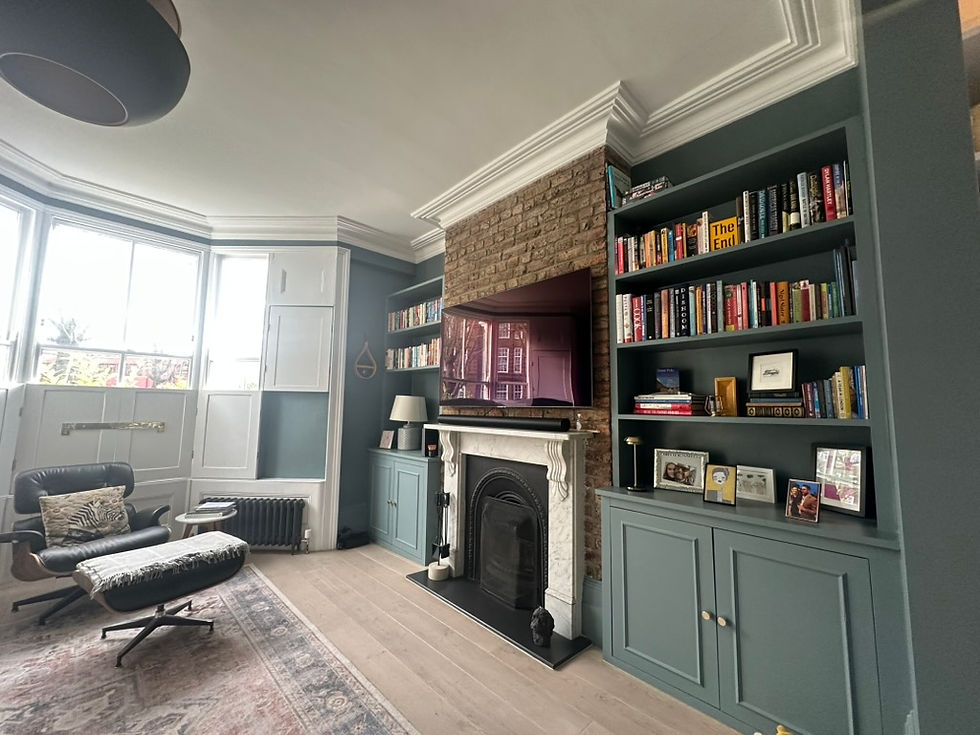
I think often there is some concern that what I'm suggesting is the equivalent of Vantablack when really it's a beautiful dusky green or soft red-pink.
What interesting interiors almost always have in common is contrast.
Even the most starkly minimalist, white box room will have contrast between the white walls and the other materials - wood, stone, fabrics etc.
And so far, no client has ever come to me for a minimalist interior because it's not what I do or what I like.
Clients come to me because they've spotted something they love on my website or on Instagram or been in their friends' home and admired the decor before being told - "you need Hannah Ashe". I like colour and I'm not afraid to use it.
But then when we get down to the nitty gritty of choosing colours following my design scheme, there's a moment of panic and the question "won't that feel really dark?". It's at this point that it's my job to explain why the paint colour in question will not feel really dark. We will talk about contrast within the room, we will talk about LRV (light reflectance values) and we will discuss how we want the room to feel.
In the early days of my interior design career I was more tentative, giving clients options and recommending the dark or bold paint colour but often finding out they had chickened out at the last minute and gone for something lighter. This would inevitably lead to them telling me that they should have listened to me...
I'm less forgiving these days. If you've paid me to design your room, and chosen me because you like my work, then it's important that you listen to suggestions I'm giving you. I work a lot on instinct, yes, but I also know through experience what will work and why.
Colours are all about balance. I'm working on a kitchen at the moment where the units will be bold (the dark tones have already been questioned) but the worktops and walls/ceilings will be lighter to create contrast. A kitchen isn't a space we want to feel enclosed and dark but we also don't want it to feel boring.
Period homes, which I specialise in, can induce more 'dark panic' than most because hallways and corridors can be dark and living rooms are often north facing. But equally, when we look back at what the Victorians were doing we see that they were not shying away from colour. Quite the opposite. So why over 100 years later is there so much worry about 'too dark'?
The key is to lean into the spaces that can take bold colour. A north-facing living room, for example, is always going to be dark whether it's painted brilliant white or dark green but the key question is the function of the room. If it's mainly used in the evenings to sit down and watch the TV in, then why do the walls need to be light? As long as the space is well lit (a topic for another day), then the bold colour will be accented and help to make the space feel cocooning and cosy.
My message to you - go for the bold colour, but make sure there's some contrast. It will never ever feel like Vantablack, but interesting colours do make you feel things and if you never explore those colours you will never know what they feel like.
And by the way, I highly recommend the Anish Kapoor exhibition. It's certainly not light and fluffy, but if you want art to make you feel something then it's well worth a visit and is on until 18th October 2026.

I'm Hannah Ashe, an interior designer specialising in Victorian and Edwardian homes working across London and Surrey supporting clients in making considered choices about how best to decorate, furnish and thoughtfully reinterpret the character of their properties.
Take a look at my portfolio, or if you'd like to talk through a project, drop me a line at info@hannahashe.co.uk.